5 Tips for Better Safety Message Designs

Engaging safety communication starts with good message design. Bold headlines and clear copy are just the foundation. Whether you’re producing printed posters, designing for digital signs or creating a PowerPoint, these five essential tips will help your safety messages be more attractive, effective and engaging.
1. Keep text clear and concise
It’s important to keep safety messages understandable at a glance. Use a short, bold headline with very minimal supporting text. A good rule of thumb is the 3x5 rule: three lines of text with five words or five lines of text with three words. The shorter the better. Your goal is to design safety messages that people can quickly digest, apply and remember.Don’t worry about perfect grammar — cut nonessential words and phrases, use digits for numbers and use & to replace “and” in text. Feel free to bullet point simple text or use icons for common concepts. In many cases, your messages are reminders versus new information, so short and sweet is the way to go.
And don’t try to put all the details about a given topic into the message. Instead, give a simple URL or QR code for people to get more in-depth information. The point of your message is to remind them to do it, not to try to give every detail. (Think of it more like a web banner ad than a webpage.) If you have a larger topic to convey, try a series of messages instead of crowding one design. Breaking up the info can create a story narrative that’s much more engaging than trying to fit long or complicated guidelines into one message.
2. Include images and animation
90% of the information processed by the brain is visual and images increase the desire to read the accompanying content by 80%. Even more importantly for safety messaging, people following directions with text and visuals do 323% better than those just given text. Additionally, the brain continues to process an image longer than the amount of time it was seen, so a visual message has a better retention and recall rate. This all builds a strong case for pairing your messages with good, attention-grabbing visuals.When you use a visual, make sure it’s high quality and relates to the subject matter. Keep in mind that funny images can often grab attention, but you’ll want to stay within your brand identity and guidelines. There are a lot of free image and video sites out there where you can find content. Just be sure you’re meeting any specified copyright guidelines.
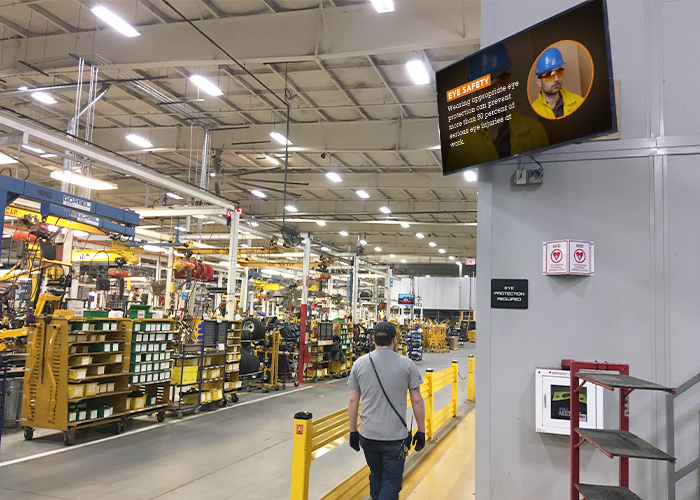
If you decide to use video, keep clips short. Ideally, your message should be able to be understood in under 10 seconds. Also, in a noisy work environment, you can’t rely on audio to get your message across, so be sure the visuals communicate what you need. If you’re using digital signs to deliver safety messages, simple transitions between messages can provide animation to grab attention.
3. Don’t forget to motivate
Safety messaging isn’t all about dos and don’ts — it’s also about motivation and recognition. Be sure to mix in messages that inspire collaboration, inclusiveness and professional development. If someone on your team has completed training or been awarded a certification, congratulate them. If production met or exceeded quota, celebrate that.Even things as simple as recognizing birthdays and anniversaries goes a long way to building goodwill. Motivational quotes and fun trivia can also increase engagement with your messages overall, ensuring people check your messages frequently so they don’t miss important safety reminders.
Most likely, you’re tracking both leading and lagging indicators for your group — share those KPIs in data-driven messages. Whether it’s inventory levels, days without injury or results of safety surveys, publishing stats, benchmarks and progress to goals is a proven motivator. When employees see how the company is doing in an area that is relevant to them, they feel included, informed and motivated to do more to reach that goal. If you’re delivering digital signage playlists, you can tie into your tracking apps to automatically update the info on screens in real time.
4. Use color-coding systems
Just like standard safety symbols use color coding to denote the subject matter or risk level, you can do the same with your designs. If you’re tackling a topic that’s already associated with an OSHA symbol or internal signage, be sure to use the same colors in your message so viewers can make an immediate connection in their minds. If you have signs around your facility that use yellow, but then use blue in your message about that subject, people can’t make that link. (The same goes for symbols and icons.)If you have a message that doesn’t relate to OSHA safety colorsor your own signage systems, you can still create a color-coding system. How you parse it is up to your individual workflows and environment.
Some ideas are:
- By topic (general safety, PPE, forklifts, COVID-19, etc.)
- By department (EHS, human resources, corporate, etc.)
- By type (events, training, kudos, KPIs)
5. Refresh and repeat
Safety messaging never rests, and it never ends. Because you’ll definitely be repeating some of the same information over time, it’s important to refresh your designs regularly. A good rule is to refresh your messages every 30 days. If that’s too much of a burden for your content creators, try for no more than every 90 days.If someone sees the same message every day for a month, they’ll eventually tune it out. (Think about the billboard you drive by every day.) That means the message is now useless to anyone but new hires, and they’ll get tired of it themselves in a couple of weeks.
But don’t worry — you don’t have to start from scratch every time. Something as simple as rewording a headline, changing the font or updating the background color can make a message new to the eye. If you’re using photos or videos, try to find a new one (or switch from one to the other). If you can’t get a new visual, move it to the other side of the message. Anything that tricks the eye into seeing the new “shape” of the message with draw attention.
If you simply don’t have the resources to create your own safety messages, or to refresh them very often, consider getting some outside help. You can take advantage of materials available through OSHA, trade unions and other industry sources, and there are vendors who offer safety message subscription services for digital signs and other onscreen mediums. Whatever you choose, just make sure you have a good mix of content and designs to keep your audience interested.
For more resources about using digital signs for safety messaging, we invite you to check out Visix Inc.’s website.
About the Author

Sean Matthews
Visix Inc.
Sean Matthews is President and CEO of Visix Inc., a digital signage solutions company headquartered in Atlanta, Georgia. His passion is helping people communicate better, and he brings that passion to every decision about products and services, as well as his management of the people, process and client experiences that make Visix a success.


